Cartoon Design and Character Development: A Chat with Animator Carlos Campos
by David Fox
Learning how to design cartoon characters starts with one simple truth: every memorable character is built on clear shapes, a distinct silhouette, and a personality that reads in seconds. Animator Carlos Campos, whose work spans indie shorts and commercial projects, shared his process with our team in a wide-ranging conversation about the craft. Whether someone is sketching their first mascot or refining a cast for a series, the principles Campos outlined apply across styles and skill levels. Our team has distilled his insights — along with broader industry wisdom — into a practical guide that covers foundations, tools, common pitfalls, and techniques anyone can start using today. For more perspectives on creative careers and artistic process, our art commentary section features interviews and deep dives from working artists.

Campos emphasized that character design is not purely about drawing ability. It is a blend of storytelling, psychology, and visual problem-solving. A well-designed character communicates who they are before a single line of dialogue is spoken. That idea — design as communication — runs through everything below.
Our team has organized this guide around the themes Campos returned to most often during our conversation: the foundational thinking behind strong characters, the tools professionals actually use, techniques for development and iteration, common mistakes worth avoiding, and the trade-offs between different design philosophies. The evolution of the animation industry has expanded what is possible, but the core principles remain remarkably stable.
Contents
- The Foundations Behind Strong Character Design
- How to Design Cartoon Characters: Core Principles
- Essential Tools and Equipment for Character Designers
- Character Development Techniques That Actually Work
- Common Character Design Mistakes and Fixes
- Weighing Different Design Approaches
- Frequently Asked Questions
- Final Thoughts
The Foundations Behind Strong Character Design
Before anyone picks up a pencil or stylus, Campos stressed that understanding the "why" behind character design decisions matters more than raw technique. A character exists to serve a story, a brand, or an emotional goal. The design should flow from that purpose.
Shape Language and Silhouettes
Shape language is the backbone of cartoon character design. Different geometric foundations trigger different emotional responses in viewers:
- Circles and round shapes — friendly, approachable, youthful (think Mickey Mouse)
- Squares and rectangles — stable, strong, dependable (think a heroic father figure)
- Triangles and angular shapes — dynamic, dangerous, villainous (think Jafar from Aladdin)
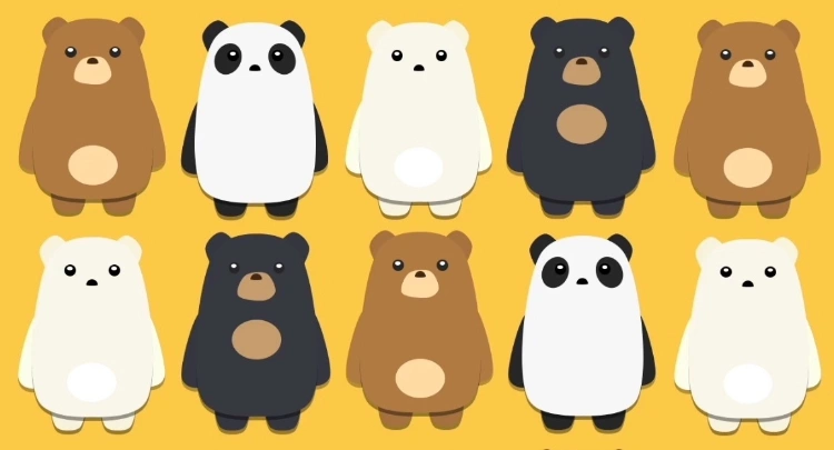
Campos recommended a quick test: fill in the character's silhouette with solid black. If the character is still recognizable, the design is working. If it blends into a generic blob, the silhouette needs more distinction. This principle traces back to the twelve basic principles of animation developed at Disney, which remain foundational for character artists worldwide.
Personality Before Pencil
One habit Campos described is writing a short character biography before sketching. This does not need to be elaborate — even a few bullet points help:
- What does this character want more than anything?
- What is their biggest flaw or contradiction?
- How do they move — fast and jerky, or slow and deliberate?
- What is one object they would never leave behind?
These answers inform design choices. A nervous character might have sharp, thin limbs. A lazy one might have heavy, drooping features. Our team has found that skipping this step is the most common reason designs feel hollow or generic.
How to Design Cartoon Characters: Core Principles
Understanding how to design cartoon characters effectively means internalizing a handful of principles that separate amateur work from professional-grade designs. Campos broke these down into two main categories.
Readability at Every Scale
A cartoon character might appear on a cinema screen, a phone, a thumbnail, or a piece of merchandise. The design needs to hold up at every size. Here are the readability rules Campos follows:
- Limit the color palette to 3–5 core colors
- Avoid small, intricate details that disappear at reduced sizes
- Use high contrast between the character and typical backgrounds
- Make the head and face proportionally larger than realistic — this is where emotion lives
- Test the design at thumbnail size early in the process
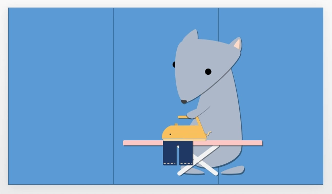
Pro tip from Campos: Print the character at the size of a postage stamp. If someone can still tell who it is, the design is solid. Most professional studios use this exact test during review rounds.
Consistency Across Poses and Expressions
A character that looks great in one pose but falls apart in others is not a finished design. Campos shared his consistency checklist:
- Draw the character from at least five angles (front, three-quarter, side, three-quarter back, back)
- Create an expression sheet with 8–12 emotions
- Test the character in both action and resting poses
- Verify that proportions stay stable when the character bends, sits, or runs
- Hand the design to another artist — if they can draw the character on-model, it is well-defined
This relates to why many artists, including those featured in our profile of Cambridge artist Bryan Rogers, emphasize process over final output. The turnaround sheet and expression sheet ARE the design — the pretty hero pose is just marketing.
Essential Tools and Equipment for Character Designers
Campos is pragmatic about tools. He uses whatever gets the job done fastest, and he encouraged the same mindset for anyone starting out.
Digital Tools and Tablets
The digital side of character design has expanded dramatically. Here is what our team sees professionals using most often:
| Tool | Type | Best For | Price Range |
|---|---|---|---|
| Clip Studio Paint | Software | Line art, comics, animation | $50–$220 (one-time) |
| Procreate | iPad App | Sketching, painting, portability | $13 (one-time) |
| Adobe Photoshop | Software | Industry-standard painting and compositing | $21/month |
| Krita | Software | Free open-source painting and illustration | Free |
| Blender (Grease Pencil) | Software | 2D animation within 3D environment | Free |
| Wacom Cintiq | Hardware | Professional pen display | $650–$3,300 |
| iPad Pro + Apple Pencil | Hardware | Portable professional drawing | $1,000–$2,200 |
| XP-Pen Artist Pro | Hardware | Budget pen display | $250–$600 |
For anyone weighing tablet options specifically, our standalone drawing tablet guide covers screen-based tablets in depth. Campos personally uses a Wacom Cintiq for studio work and an iPad Pro for sketching on the go.

Traditional Media That Still Matter
Despite the digital shift, Campos keeps traditional tools in his workflow. Here is why:
- Pencil and paper sketching — faster for initial brainstorming with zero boot-up time
- Markers (Copic, Prismacolor) — force commitment to color choices in a way digital undo buttons do not
- Sculpting clay or maquettes — help understand a character in three dimensions before drawing turnarounds
- Ink pens — build confidence in line weight and decisiveness
Campos noted that many animation studios still ask candidates to submit traditional sketches alongside digital portfolios. The ability to draw without ctrl+Z demonstrates fundamental skill.
Character Development Techniques That Actually Work
Designing a character is only half the job. Developing that character — refining, iterating, and pressure-testing the design — is where professionals spend most of their time.
The Power of Iteration
Campos showed our team his process for a recent project: 47 thumbnail sketches before selecting three directions to develop further. That ratio is normal. Here is the iteration framework he uses:
- Thumbnail storm — draw 20–50 tiny (1-inch) silhouettes in 30 minutes. No erasing. Speed matters.
- Select and refine — pick 3–5 thumbnails that have interesting shapes. Redraw at larger scale.
- Combine and remix — take the best features from different sketches and merge them.
- Color exploration — try at least 5 color palettes on the same line art.
- Context test — place the character against backgrounds and alongside other characters from the same project.
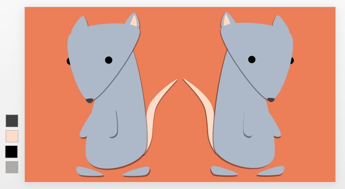
Most people skip the thumbnail stage and jump straight to detailed drawings. Campos called this "polishing before exploring" and considers it the single biggest time-waster in character design.
Building a Reference Sheet
A character reference sheet (also called a model sheet) is the design's final deliverable. It is what other artists, animators, or modelers use to reproduce the character accurately. A solid reference sheet includes:
- Full turnaround (front, side, back, three-quarter views)
- Expression sheet (happy, sad, angry, surprised, disgusted, scared, neutral, plus character-specific emotions)
- Scale comparison with other characters in the project
- Color palette with exact hex codes or Pantone values
- Costume or accessory variations
- Notes on proportions (head-to-body ratio, limb lengths)
- Action poses showing how the character moves
Campos pointed out that reference sheets serve as a contract between the designer and the production team. Ambiguity in the sheet leads to inconsistency in the final product. Anyone exploring digital art apps on a smartphone can even start roughing out reference sheets on the go.
Common Character Design Mistakes and Fixes
Campos has reviewed thousands of student and junior portfolios over his career. Certain mistakes appear repeatedly. Recognizing them early saves enormous time.
Overcomplicating the Design
The most common problem Campos sees is over-designed characters. Warning signs include:
- More than 6 colors in the main palette
- Asymmetrical details that serve no story purpose
- Accessories or costume elements that would be impossible to animate consistently
- Overly detailed textures or patterns that read as noise at small sizes
- Hair or clothing with physics-defying complexity
The fix is straightforward: simplify until it hurts, then add back one element. If the character still works without that element, it was not needed. Campos referenced the Japanese design principle of "ma" (negative space) — what is left out defines the character as much as what is included. Our piece on Japanese ukiyo-e prints explores how this philosophy shaped an entire artistic tradition.

Campos's rule of thumb: If a design element cannot be explained in five words or fewer — like "shows she's a mechanic" or "indicates royal background" — it probably does not belong.
Ignoring the Story Context
A character does not exist in a vacuum. Common context-related mistakes include:
- Designing a villain who looks more appealing than the hero
- Creating a cast where every character has similar proportions and silhouettes
- Using a color palette that clashes with the project's environment art
- Giving a character abilities or accessories that contradict the world's rules
Campos recommended designing the entire main cast simultaneously, even if only in rough form. This ensures contrast between characters and prevents the "same face syndrome" that plagues many student projects. Place characters side by side and ask: can someone tell them apart from silhouette alone?
Weighing Different Design Approaches
There is no single correct way to approach character design. Different projects, studios, and artistic goals call for different methods. Our team asked Campos to break down the trade-offs.
Stylized vs. Semi-Realistic
This is the first fork in the road for most character designers:
- Highly stylized (e.g., Adventure Time, Powerpuff Girls)
- Pros: faster to produce, easier to animate, more memorable silhouettes, appeals to broader age ranges
- Cons: can feel limiting for dramatic storytelling, harder to convey subtle emotions
- Semi-realistic (e.g., Avatar: The Last Airbender, Arcane)
- Pros: greater emotional range, appeals to older audiences, more room for detailed world-building
- Cons: higher production cost, more difficult to keep on-model, longer turnaround times
Campos noted that the industry has been trending toward a middle ground — stylized shapes with realistic lighting and texture. This hybrid approach keeps production manageable while delivering visual richness.
Solo Workflow vs. Team Pipeline
How someone designs characters changes depending on whether they are working alone or within a studio pipeline:
- Solo/freelance
- Full creative control from concept to final
- Faster decision-making with no approval bottlenecks
- Risk of tunnel vision without outside feedback
- Must handle all technical requirements (turnarounds, model sheets, color flats) alone
- Studio/team pipeline
- Designs pass through concept, review, revision, and approval stages
- Multiple artists may refine a single character
- Feedback loops catch problems early but slow the process
- Requires clear documentation and communication
For solo creators, Campos strongly recommended finding a critique partner or joining an online community for regular feedback. Even a single trusted outside perspective catches blind spots that weeks of solo work will not reveal.
Frequently Asked Questions
What is the first step in learning how to design cartoon characters?
Start by studying shape language — circles, squares, and triangles — and how each shape triggers different emotional responses. Practice drawing simple characters built from one dominant shape before adding complexity. Most beginners benefit from copying existing cartoon characters to understand how professionals use these shapes.
Do most character designers need to know how to animate?
Not necessarily, but understanding basic animation principles helps enormously. A character designer who knows how a figure moves will create designs that are practical to animate. Many studios consider animation knowledge a bonus rather than a requirement for dedicated design roles.
How long does it take to design a single cartoon character professionally?
Timelines vary widely. A simple mascot might take one to two weeks from concept to final reference sheet. A main character for a series often takes four to eight weeks, including multiple revision rounds. Campos noted that rushing the exploration phase almost always leads to costly redesigns later.
What software do most professional character designers use?
Clip Studio Paint and Adobe Photoshop dominate the industry. Procreate has gained significant ground for initial sketching and concept work. Some studios use Blender's Grease Pencil for characters intended for 2D animation. The specific tool matters less than understanding design fundamentals.
Can someone learn character design without formal art school training?
Absolutely. Many working character designers are self-taught or learned through online courses, YouTube tutorials, and community feedback. Campos himself supplemented his formal training with years of independent study. Consistent daily practice and seeking honest critique matter more than any specific credential.
How important is color theory in cartoon character design?
Color theory is critical. Colors communicate personality, mood, and narrative role instantly. Heroes tend toward warm, saturated colors while villains often use cooler or desaturated palettes. Our team recommends studying color scripts from animated films to see how professionals use color to tell stories.
What makes a character design "appealing" versus just technically correct?
Appeal comes from clear shapes, confident line work, and a sense of personality that feels authentic. A technically perfect drawing can still feel lifeless if it lacks charm or character. Campos described appeal as "the design wanting to be looked at" — something that draws the eye and holds attention.
How does character design differ for games versus animation?
Game characters need to read clearly against dynamic backgrounds and at variable camera distances. They often require more costume or silhouette variation to distinguish player characters during gameplay. Animated characters are typically designed for fixed camera setups and specific scene compositions, allowing for more nuanced design choices that work within controlled framing.
Final Thoughts
Our conversation with Carlos Campos reinforced something our team hears from working artists again and again: great cartoon character design is less about talent and more about process. The fundamentals — shape language, silhouette testing, iteration, and designing with story context in mind — are learnable skills that improve with practice. Pick one character idea, commit to the thumbnail-to-reference-sheet pipeline outlined above, and finish it completely before starting the next one. Finishing designs, not just starting them, is what builds real skill.


About David Fox
David Fox is an artist and writer whose work spans painting, photography, and art criticism. He created davidcharlesfox.com as a platform for exploring the history, theory, and practice of visual art — covering everything from Renaissance masters and modernist movements to contemporary works and the cultural context that shapes how art is made and received. At the site, he covers art history, architecture, anime art and culture, collecting guidance, and profiles of influential artists across centuries and movements.
Now get FREE Gifts. Or latest Free phones here.
Disable Ad block to reveal all the secrets. Once done, hit a button below


